You can make the best video in the world. But if nobody clicks on it, nobody will see it. On YouTube, the battle for attention is won or lost in a single glance. Your video's title is important, but the YouTube thumbnail is what truly grabs a viewer's eye. It is the single most important factor for a high Click-Through Rate (CTR).
A high CTR tells YouTube's algorithm that your video is interesting. The algorithm then shows your video to more people. This creates a cycle of growth. So, how do you create thumbnails that people can't resist clicking? We'll share 5 design secrets that top YouTubers use to make their thumbnails stand out and get more views.

Secret 1: Use Bright, Contrasting Colors
The YouTube homepage is a crowded place. Your thumbnail needs to pop. The best way to do this is with color. Dull or dark colors will blend in and get ignored.
How to Use Color Effectively:
- High Contrast: Use bright colors that contrast with each other and with YouTube's dark and light themes. Think bright yellows, greens, and blues against a dark background.
- Brand Colors: Use a consistent color palette across all your thumbnails. This helps people recognize your videos instantly.
- Color Psychology: Use colors that evoke emotion. Red can create urgency, blue can build trust, and yellow can grab attention.
Advertisement
Secret 2: Include a Human Face with Clear Emotion
Our brains are hardwired to notice faces. Including a close-up shot of a human face in your thumbnail can dramatically increase your CTR. But just any face is not enough. The emotion is key.
How to Use Faces and Emotion:
- Show Emotion: The face should show a strong, clear emotion related to the video's content. Are you shocked, excited, or happy? An emotional face creates curiosity.
- Make Eye Contact: The eyes in the photo should ideally look towards the camera or the main subject of the thumbnail. This creates a connection with the viewer.
- High-Quality Image: Use a clear, well-lit photo of your face. A blurry or dark photo will look unprofessional.
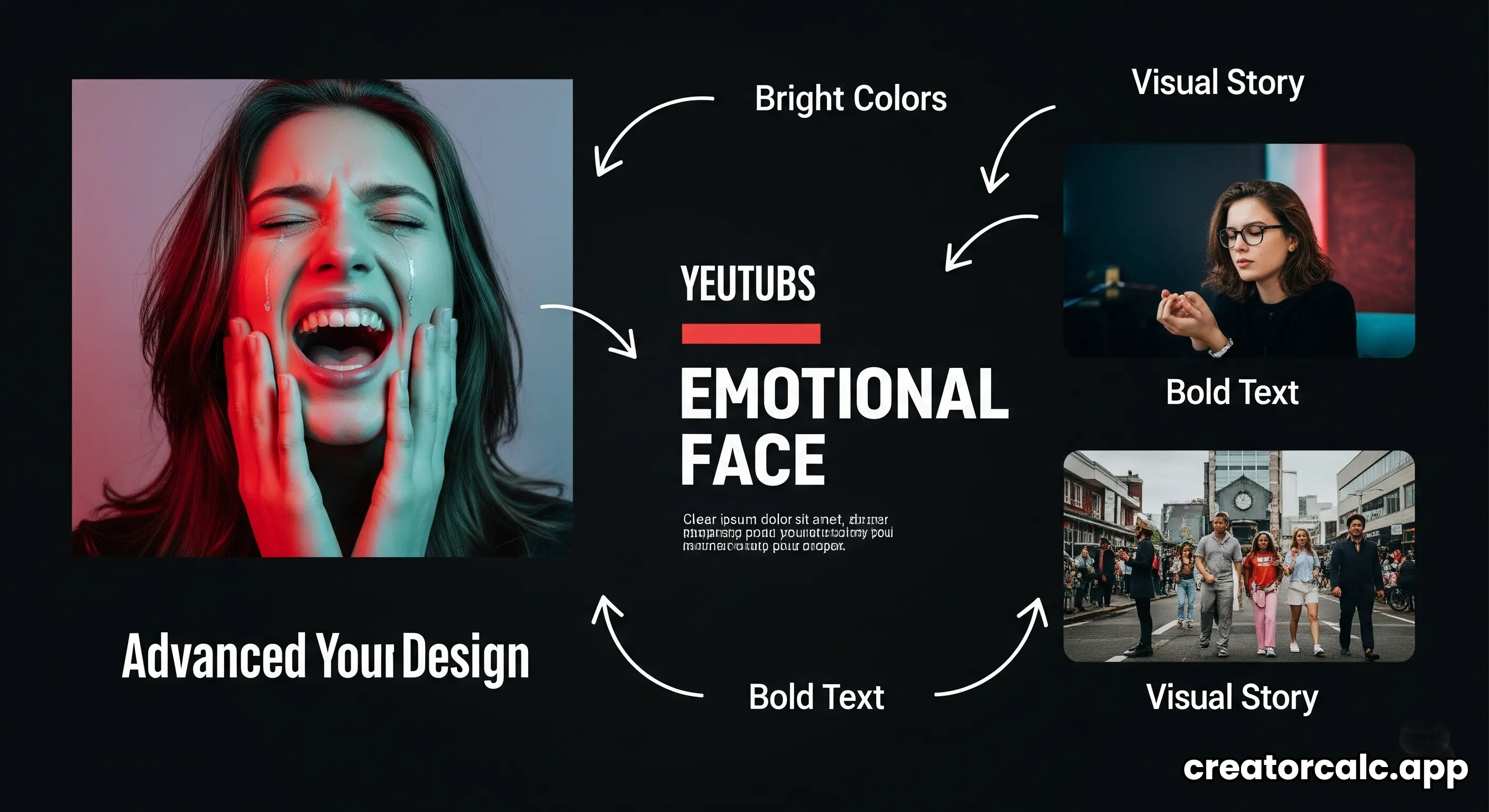
Secret 3: Use Big, Bold, and Readable Text
Your thumbnail needs to communicate the video's topic in less than a second. A few words of text can help do this. But the text must be very easy to read.
Rules for Thumbnail Text:
- Keep it Short: Use only 3-5 powerful words. The text should add context that is not in the title. For example, if the title is "I Tested The New iPhone", the thumbnail text could be "MIND-BLOWING!".
- Use a Bold Font: Choose a thick, bold, sans-serif font (like Poppins or Impact). It needs to be readable even on a tiny mobile screen.
- High Contrast: The text color must have high contrast with the background. A common technique is to put a solid color outline or a shadow behind the text to make it pop.
Secret 4: Tell a Visual Story (Create Intrigue)
A great thumbnail hints at a story. It makes the viewer ask a question. "What happened next?" or "How did they do that?"
- Before and After: Show a dramatic transformation. This works great for DIY, fitness, or cleaning videos.
- Use Arrows and Circles: A simple red arrow or circle can draw attention to a specific, interesting part of the image. But don't overdo it.
- Show the "Result": Instead of showing the process, show the amazing end result. If your video is about baking a cake, show a picture of the perfect, delicious cake.
Secret 5: Keep It Simple and Uncluttered
This final secret brings everything together. It's easy to get excited and add too many things to your thumbnail. A busy, cluttered thumbnail is confusing. Simplicity is key. A good thumbnail usually has only three main components: a background, a main subject, and a few words of text.
Frequently Asked Questions (FAQs)
1. What is the best size for a YouTube thumbnail?
The ideal size is **1280 x 720 pixels**, which is a 16:9 aspect ratio. The image file should be under 2MB and saved as a JPG or, preferably, WebP.
2. Do I need expensive software like Photoshop?
No. While Photoshop is a great tool, there are many free and easy-to-use alternatives. Tools like Canva are excellent for creating professional-looking YouTube thumbnails, even for beginners.
3. Should all my thumbnails look the same?
They shouldn't be identical, but they should be consistent. Use the same fonts, color palette, and logo placement across your thumbnails. This creates a strong, recognizable brand for your channel.
4. How do I know if my thumbnail is good?
Look at your Click-Through Rate (CTR) in YouTube Analytics. A good CTR for a new video is typically between 2% and 10%. If your CTR is low, it might be a sign that your thumbnail and title are not effective. YouTube also has a "test and compare" feature that lets you try out different thumbnails.